Color Themes
This feature is available with the Plugin Expansion plan and higher.
If you're on the Plugin for Startup plan, consider upgrading to access this feature. For more details, visit our pricing page or contact support.
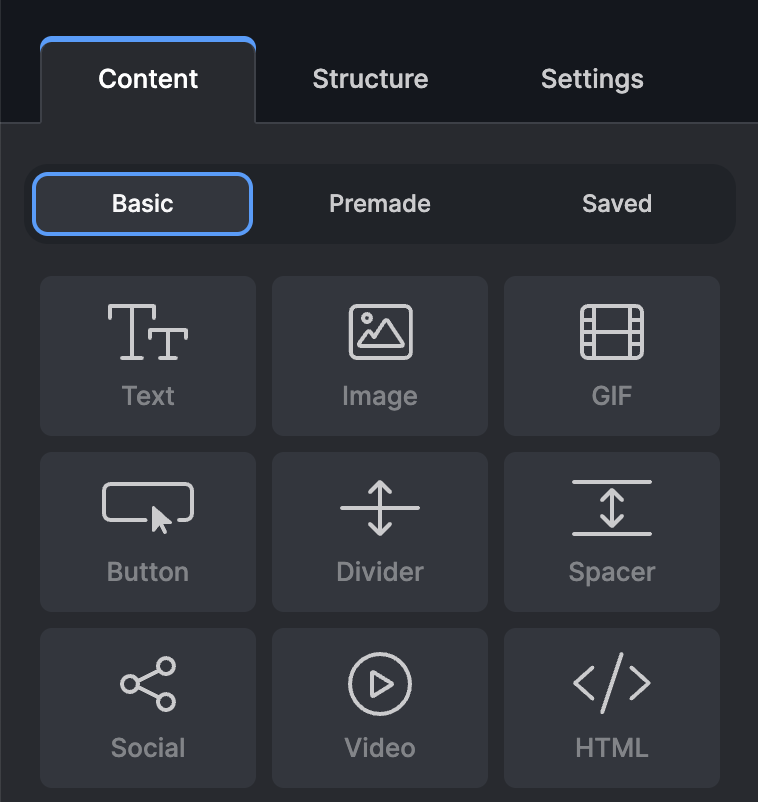
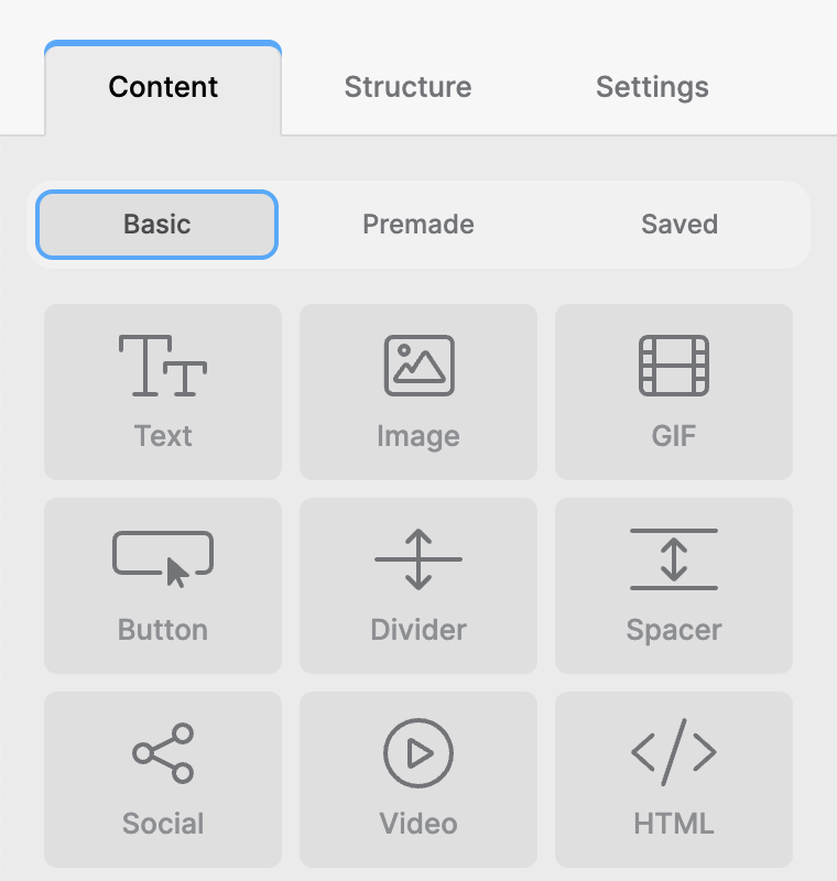
Topol offers flexible theming options for the plugin editor interface, allowing you to tailor the editor’s visual style to match your application or branding.
Built-in Themes
Topol provides two built-in design presets:
Dark Theme (default)
Ideal for low-light environments or applications with dark UI styling.

This theme is used by default, but it can also be set with the light: false option.
light: false, // or skip this optionLight Theme
Clean and minimal, great for daylight or traditional UI settings.

To switch the editor to the light theme preset, use the light: true option.
light: true,Custom Theme
If you want complete control over the editor's appearance, you can define your own custom theme using the theme object in TOPOL_OPTIONS.
This overrides the light: true option and provides you full flexibility over the editor’s color scheme.
Default Dark Theme:
theme: {
  preset: 'dark',
  colors: {
      '900': "#13171E",
      '800': "#1F2329",
      '700': "#272A30",
      '600': "#32363E",
      '500': "#3C4048",
      '400': "#494D55",
      '300': "#575B62",
      '200': "#828488",
      '100': "#CBCBCD",
      '50': "#F7F7F8",
      '10': "#FBFBFC",
      white: '#ffffff',
      primary: '#9D82FF',
      'primary-light': '#B4A0FF',
      'primary-light-2': '#DFD9FF',
      secondary: '#11CFC4',
      'secondary-light': '#00E5D8',
      'secondary-light-2': '#CEFAF8',
      error: '#C4261A',
      'error-light': '#E32F22',
      'success': '#11BA5C',
      'success-light': '#0CDB68',
      'active': '#409EFF',
      'active-2': '#00DE52',
      'active-3': '#FF9900',
  }
}
Default Light Theme:
theme: {
  preset: 'light',
  colors: {
      '900': "#F7F7F8",
      '800': "#F1F1F2",
      '700': "#EBEBEC",
      '600': "#DFDFE0",
      '500': "#D7D8D9",
      '400': "#C9CACB",
      '300': "#A4A5A7",
      '200': "#8D8F92",
      '100': "#727477",
      '50': "#4B4C4E",
      '10': "#2B2B2C",
      white: '#ffffff',
      primary: '#9D82FF',
      'primary-light': '#B4A0FF',
      'primary-light-2': '#DFD9FF',
      secondary: '#11CFC4',
      'secondary-light': '#00E5D8',
      'secondary-light-2': '#CEFAF8',
      error: '#C4261A',
      'error-light': '#E32F22',
      'success': '#11BA5C',
      'success-light': '#0CDB68',
      'active': '#35AAFF',
      'active-2': '#0FCE56',
      'active-3': '#FF9900',
  }
}
Color of Locked Structures and Content Blocks
You can set the background color and opacity of all locked structures and locked content blocks in your templates. To set the specific color, use the following options:
theme: {
  preset: "light", // or dark
  colors: {
    // all other color settings
    "locked-structure": "your color as a string", //set color of all locked structures
    "locked-content": "your color as a string", //set color of all locked content blocks
  }
}
When setting locked-content color, the color appears in the foreground; therefore, you must adjust the color opacity. Otherwise, the block content will be completely hidden behind the color. Opacity can be easily adjusted by defining your colors in the RGBA color model using the rgba() function.
When setting locked-structure color, the color appears behind the structure content, so adjusting the opacity is not necessary, but it is highly recommended.
Structures and content blocks can be locked by using our Roles and permission feature.
Canvas Color in Email Background
Additionally, it might make sense to change an email canvas background, used only for designing purposes. This canvas color will not be seen in final email. To change the email background opt for Email background in Settings.
theme: {
  canvasColor: "#e2e2e2";
}