
Custom API Blocks
A Custom API Block lets you pull in live data from an external API and display it dynamically inside your email templates. This means you can show categorized data—like product lists, news items, or any other grouped content—and style it just the way you want right inside the Topol editor. This documentation provides a detailed guide on how to structure your API endpoints and style the data within your templates.
Why use Custom API Blocks?
This feature lets you build dynamic email sections that automatically update from your data source without manual editing. For example, you can create product catalogs, event lists, or news sections that pull fresh data every time you use the template.
API Endpoint Structure
To use a Custom API Block, your API needs to provide two endpoints (feeds and items) and may optionally provide a third one for categories.
1. Feeds Endpoint:
This is a list of categories or groups. For example, if you're showing products, this could be product categories like "Shoes," "Hats," or "Accessories." The API will send back something like this:
Expected Response for the Feed Endpoint
{
  "success": true,
  "data": [
    {
      "id": 1,
      "name": "Feed 1"
    },
    {
      "id": 2,
      "name": "Feed 2"
    },
    {
      "id": 3,
      "name": "Feed 3"
    },
    {
      "id": 4,
      "name": "Feed 4"
    }
  ],
  "total_records": 4
}
2. Items Endpoint:
For each category, this endpoint returns the detailed items to show. For example, the actual products within a category. The data might look like this:
Expected Response for the Items Endpoint
{
  "success": true,
  "data": [
    {
      "id": 1,
      "name": "Block 1",
      "image": "https://storage.googleapis.com/topol-io-plugin-97de3577-4897-4379-9699-a51756301fab/plugin-assets/17326/user/warsaw.jpg",
      "href": "https://www.topol.io",
      "my-text-1": "My text 1 in block 1",
      "my-text-2": "My text 2 in block 1",
      "my-text-3": "My text 3 in block 1",
      "feed_id": 1
    },
    {
      "id": 2,
      "name": "Block 2",
      "image": "https://storage.googleapis.com/topol-io-plugin-97de3577-4897-4379-9699-a51756301fab/plugin-assets/17326/user/prague.jpg",
      "href": "https://www.topol.io",
      "my-text-1": "My text 1 in block 2",
      "my-text-2": "My text 2 in block 2",
      "my-text-3": "My text 3 in block 2",
      "feed_id": 1
    },
    {
      "id": 3,
      "name": "Block 3",
      "image": "https://storage.googleapis.com/topol-io-plugin-97de3577-4897-4379-9699-a51756301fab/plugin-assets/17326/user/bridge.jpg",
      "href": "https://www.topol.io",
      "my-text-1": "My text 1 in block 3",
      "my-text-2": "My text 2 in block 3",
      "my-text-3": "My text 3 in block 3",
      "feed_id": 1
    }
  ],
  "total_records": 3
}
3. Categories Endpoint (optional):
For each feed, this endpoint returns a list of categories that can be used to further narrow the items in the selection modal. If you don't define categoriesURL on the block, the category dropdown is hidden and users only filter by feed.
The endpoint receives the selected feed via the feed_id query parameter and should return:
{
  "success": true,
  "data": [
    { "id": 1, "name": "Category 1", "feed_id": 1 },
    { "id": 2, "name": "Category 2", "feed_id": 1 }
  ],
  "total_records": 2
}
When a category is picked, the items endpoint is called again with the additional category_id query parameter so it can return a filtered subset.
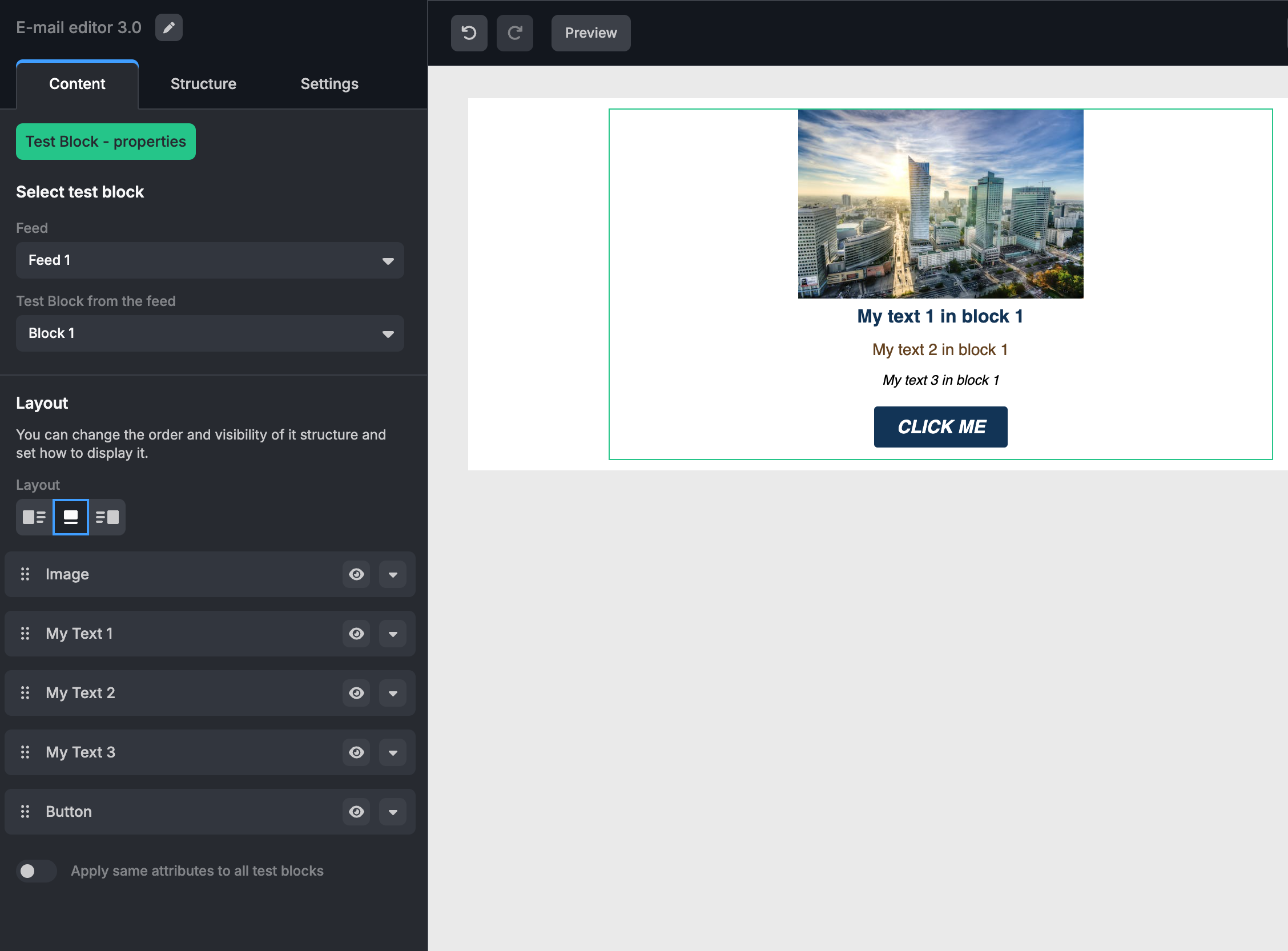
How to Configure a Custom API Block
The configuration for a Custom API Block defines how the data is mapped and styled within your template. Below is a detailed example of the configuration.
Example of a Custom API Block
  apiBlocks: {
      testBlock: {
        itemsURL: "https://example.test/my-block",
        feedsURL:
          "https://example.test/my-block-feeds",
        categoriesURL:
          "https://example.test/my-block-categories", // optional
        name: "Test Block",
        pluralName: "Test Blocks",
        icon: "",
        // optional — see "Static and Dynamic Mode" below
        dynamicMergetags: [
          { label: "Recommended items", value: "REC_ITEMS" },
        ],
        // optional — see "Mapping API Field Names" below
        apiStructure: {
          name: "product_name",
          image: "image_url",
        },
        blockStructure: {
          image: {
            defaultValue:
              "https://s3-eu-west-1.amazonaws.com/ecomail-assets/editor/pp1.png",
            label: "Image",
            width: 250,
            align: "center",
          },
          href: {
            defaultValue: "*|MY_HREF|*",
          },
          "my-text-1": {
            defaultValue: "*|MY_TEXT_1|*",
            label: "My Text 1",
            "font-size": "16px",
            color: "#123456",
            "font-family": "Helvetica, Arial, sans-serif",
            "font-weight": "bold",
          },
          "my-text-2": {
            defaultValue: "*|MY_TEXT_2|*",
            label: "My Text 2",
            "font-size": "14px",
            color: "#654321",
            "font-family": "Helvetica, Arial, sans-serif",
            "font-weight": "normal",
          },
          "my-text-3": {
            defaultValue: "*|MY_TEXT_3|*",
            label: "My Text 3",
            "font-size": "12px",
            color: "#000000",
            "font-family": "Helvetica, Arial, sans-serif",
            "font-weight": "normal",
            "font-style": "italic",
          },
          button: {
            defaultValue: "Click me",
            label: "Button",
            align: "center",
            "background-color": "#123456",
            color: "#ffffff",
            "font-size": "16px",
            "font-family": "Helvetica, Arial, sans-serif",
            "font-weight": "bold",
            "font-style": "italic",
            "text-transform": "uppercase",
            "text-decoration": "none",
            "border-radius": "3px",
            padding: "10px 20px 10px 20px",
          },
        },
      },
    },
Styling Attributes
The block configuration includes several customizable styling attributes for different elements within the Custom API Block.
Image
defaultValueDefault image URL.labelDescriptive label for the image.widthImage width (in pixels).alignAlignment of the image (e.g., center, left, right).
Hyperlink (href)
defaultValueDefault URL or placeholder for the hyperlink.
Text Field
Each text field can be customized with various styling attributes:
defaultValueDefault text or placeholder.labelDescriptive label for the text field.font-sizeFont size (e.g., 16px).colorText color (e.g., #123456).font-familyFont family (e.g., Helvetica, Arial, sans-serif).font-weightFont weight (e.g., bold, normal).font-styleFont style (e.g., italic).
Button
defaultValueDefault button text.labelDescriptive label for the button.alignButton alignment (e.g., center).background-colorBackground color of the button.colorText color.font-sizeFont size.font-familyFont family.font-weightFont weight.font-styleFont style.text-transformText transformation (e.g., uppercase).text-decorationText decoration (e.g., none).border-radiusBorder radius (in pixels).paddingPadding around the button (e.g., 10px 20px 10px 20px).
Static and Dynamic Mode
By default, a Custom API Block works in static mode: the user picks specific items from a feed (and optionally a category), and those exact items are saved into the template.
To also support a dynamic mode — where the block is bound to a merge tag and the ESP fills in real items at send time — set dynamicMergetags on the block:
apiBlocks: {
  testBlock: {
    // ...
    dynamicMergetags: [
      { label: "Recommended items", value: "REC_ITEMS" },
      { label: "Last viewed", value: "LAST_VIEWED" },
    ],
  },
},
Each entry becomes one option in the block's dynamic-mode dropdown — label is shown to the user, value is what the renderer uses internally. The same global requirements as for the built-in Product block apply (emailServiceProvider: "sparkpost" and smartMergeTags enabled with syntax).
When dynamicMergetags is set, the editor also synthesizes a Loop Merge Tag for each entry, with childrenProperties derived automatically from your blockStructure keys. This means the merge tag becomes selectable in Loop Blocks too.
Mapping API Field Names
Your blockStructure defines the editor's internal field names (e.g. name, image, my-text-1). If your API returns items with different field names — say product_name instead of name — use apiStructure to map them:
apiBlocks: {
  testBlock: {
    // ...
    apiStructure: {
      name: "product_name",
      image: "image_url",
      "my-text-1": "short_description",
    },
  },
},
The keys are your blockStructure names; the values are the field names in your API response. The editor reads item[apiStructure[key]] and stores it under key, so the rest of the editor can stay agnostic of the upstream JSON shape.
If apiStructure is omitted, the editor expects API field names to match blockStructure keys exactly.