
Appearance

Themes and appearance
This feature is available with the Plugin Expansion plan and higher.
If you're on the Plugin for Startup plan, consider upgrading to access this feature. For more details, visit our pricing page or contact support.
The editor ships with a dark and a light preset, and the theme object lets you override the colors, corner rounding, interface font, and canvas on top of either one. Theming applies to the editor interface, not to the emails designed in it.
Built-in themes
Two built-in design presets are available.
Dark theme (default)
Suited to low-light environments or applications with dark UI styling.
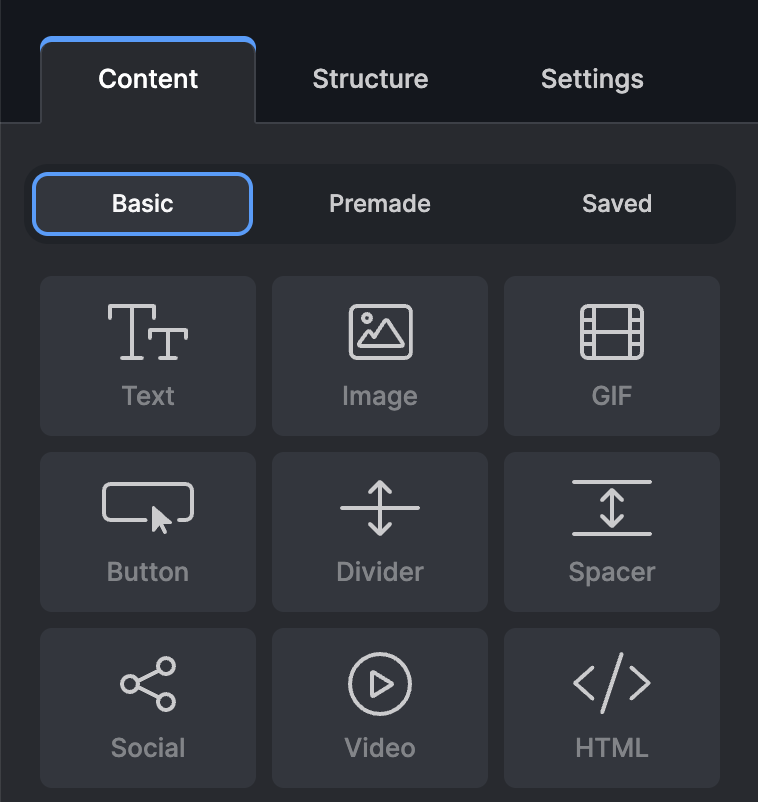
This theme applies by default, and can also be set explicitly with light: false.
ts
light: false, // or skip this optionLight theme
Clean and minimal, for daylight or traditional UI settings.
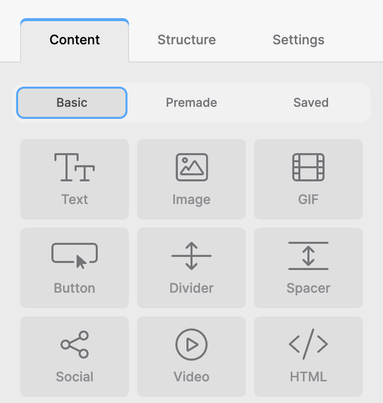
To switch the editor to the light preset, use light: true.
ts
light: true,Custom theme
For complete control over the editor's appearance, define a custom theme with the theme object in TOPOL_OPTIONS.
The theme object accepts the following top-level properties:
| Property | Type | Description |
|---|---|---|
preset | 'dark' | 'light' | The base color preset the editor starts from. Any colors you supply are merged on top of this preset, and any color you omit falls back to the preset's default. Defaults to 'dark' when not set. |
colors | object | Overrides for individual interface colors (see the examples below). |
borderRadius | object | Overrides for the editor's corner-rounding values (see Border Radius). |
canvasColor | string | The email canvas background color used while designing (see Canvas Color in Email Background). |
font | object | The font used across the editor interface (see Custom Font). |
The preset property
preset selects which built-in palette the custom theme is layered on top of, giving the editor defaults for every color left unspecified. It is optional and falls back to 'dark'.
ts
theme: {
  preset: 'light', // or 'dark', defaults to 'dark' if omitted
}
Set preset to match the light option rather than against it. Use preset: 'light' together with light: true, and preset: 'dark' with light: false or no light option at all.
Preset greyscale palettes
The numbered keys are the interface greyscale, and they are the only colors that differ between the two presets. Supplying any of them overrides that step for the preset in use.
js
// preset: 'dark'
colors: {
    '900': "#13171e",
    '800': "#1f2329",
    '700': "#272a30",
    '600': "#32363e",
    '500': "#3c4048",
    '400': "#494d55",
    '300': "#575b62",
    '200': "#828488",
    '100': "#cbcbcd",
    '50': "#f7f7f8",
    '10': "#fbfbfc",
    'active': '#409eff',
    'active-2': '#00de52',
}
js
// preset: 'light'
colors: {
    '900': "#f7f7f8",
    '800': "#f1f1f2",
    '700': "#ebebec",
    '600': "#dfdfe0",
    '500': "#d7d8d9",
    '400': "#c9cacb",
    '300': "#a4a5a7",
    '200': "#8d8f92",
    '100': "#727477",
    '50': "#4b4c4e",
    '10': "#2b2b2c",
    'active': '#35aaff',
    'active-2': '#0fce56',
}
Brand and status colors
The remaining keys are identical in both presets. They carry Topol's brand and status colors, and they are the ones most worth overriding to match your own branding.
js
theme: {
  preset: 'dark', // or light
  colors: {
      white: '#ffffff',
      primary: '#a259ff',
      'primary-light': '#8729ff',
      'primary-light-2': '#dfd9ff',
      secondary: '#25c589',
      'secondary-light': '#16ae75',
      'secondary-light-2': '#cefaf8',
      error: '#c4261a',
      'error-light': '#e32f22',
      'success': '#11ba5c',
      'success-light': '#0cdb68',
      'active-3': '#ff9900',
  }
}
The primary keys tint structure-level UI, secondary tints content-level UI, and error / success / active-3 cover the status states.
Border radius
The borderRadius object controls how rounded the editor's interface corners are. Each key is optional and accepts any valid CSS border-radius value as a string (for example "4px", "0.5rem", or "0" for sharp corners).
ts
theme: {
  preset: "dark", // or light
  borderRadius: {
    extraSmall: "2px",  // compact UI elements, e.g. small chips and tags (default: 0.25rem)
    small: "6px",       // inputs, buttons and similar controls (default: 6px)
    large: "8px",       // larger surfaces, e.g. panels and cards (default: 8px)
    extraLarge: "12px", // largest, most prominent containers (default: 0.75rem)
  },
}
small and large each drive two internal rounding steps, so setting them changes slightly more of the interface than the single default value suggests.
Custom font
By default the editor interface uses the Inter font. The font object replaces it. This affects only the editor's user interface and does not change the fonts available inside your templates.
The font object accepts two optional keys:
| Key | Type | Description |
|---|---|---|
family | string | The font family applied to the editor interface (for example "Georgia"). If you pass a single family without a fallback, sans-serif is appended automatically. |
url | string | A stylesheet URL that loads the font, for example a Google Fonts link. The stylesheet is injected for you, so the font is available before it is applied. |
ts
theme: {
  font: {
    family: "Georgia", // applied across the editor interface
    url: "https://fonts.googleapis.com/css2?family=Georgia&display=swap", // loads the font
  },
}
Both keys are optional and work independently. url loads a font the browser doesn't already have, and family switches the interface to it. For a font that is already available (a system font, or one your application has loaded), set family on its own and leave out url.
To control the fallback yourself, pass a full font stack as the family. A value that already contains a comma is used as-is and nothing is appended:
ts
theme: {
  font: {
    family: "Georgia, serif",
  },
}
WARNING
Custom fonts come from outside our official codebase, so we can't guarantee how a given font will render in the editor. Some fonts may affect the spacing or legibility of certain controls. Test your chosen font well before using it in production.
Color of locked structures and content blocks
The background color and opacity of all locked structures and locked content blocks is configurable through two dedicated color keys:
js
theme: {
  preset: "light", // or dark
  colors: {
    // all other color settings
    "locked-structure": "your color as a string", //set color of all locked structures
    "locked-content": "your color as a string", //set color of all locked content blocks
  }
}
The locked-content color appears in the foreground, so it needs reduced opacity. At full opacity the block content is completely hidden behind the color. Define the color in the RGBA model using the rgba() function to control this.
The locked-structure color sits behind the structure content, where reduced opacity is recommended rather than required. Both defaults are already semi-transparent.
Structures and content blocks are locked through the Roles and permissions feature.
Canvas color in email background
The email canvas background is the working surface behind the design, and it never appears in the final email. It defaults to #eaeaea.
js
theme: {
  canvasColor: "#e2e2e2";
}
To change the background of the email itself rather than the canvas, use Email background in the editor's Settings panel.