

Appearance

Beta Features
Beta features are content blocks that work today but are still evolving. They ship early so they can be tried in real templates and their behavior, options, and output refined based on what comes back.
WARNING
Because beta features are still being iterated on, their options, default styling, or rendered HTML may change in future releases. We recommend reviewing the changelog if your templates rely on a beta block.
Every beta feature is opt-in and off by default. Enabling one takes a flag in the betaFeatures option of your TOPOL_OPTIONS configuration, after which the block appears in the Content Blocks panel in the editor sidebar with a "Beta" tag.
Enabling beta features
Add the betaFeatures object to your plugin configuration and set a flag to true for each feature your users should see:
ts
TOPOL_OPTIONS = {
  // ...your other options
  betaFeatures: {
    carousel: true,
    rating: true,
  },
};
Two beta features are currently available: the Carousel Block and the Rating Block.
Carousel Block
The Carousel Block places an image slideshow in a template, which suits product showcases, promotional banners, and feature highlights where several images share one block.
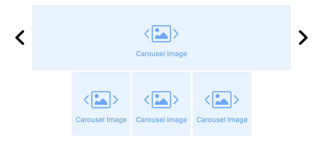
Enable it with:
ts
betaFeatures: {
  carousel: true,
},
Once enabled, drag the Carousel block from the Content Blocks panel into your template and configure its images and behavior from the left-hand settings panel.
The block supports:
- Image list: add, remove, and reorder slides directly from the settings panel. Each slide can have its own image source, link (
href),alttext, andtitle. - Image styling: a shared corner radius applied to every slide, so the carousel matches the rest of your template.
- Navigation arrows: toggle the left and right arrows on or off, choose from a built-in library of arrow icon sets (three arrow shapes, with fill and outline variants in black, grey, and white), and control the arrow size.
- Thumbnails: an optional strip of thumbnails below the main image, with configurable width, corner radius, hover border color, and selected border color.
- Padding and visibility: standard padding controls plus the Hide on mobile and Hide on desktop toggles available to every block.
Email client support
The Carousel Block uses MJML's interactive carousel, built on hidden radio inputs with :checked rather than JavaScript, since most email clients strip scripts. The interactive slideshow therefore works only in clients that support the technique, notably Apple Mail and the native Mail apps on iOS and Android. Everywhere else the block falls back to the first image as a static image, so design that first slide to stand on its own.
Rating Block
The Rating Block collects feedback directly from the email. Each segment is a clickable link, so the score a recipient picks reaches your backend through the URL they open.

Enable it with:
ts
betaFeatures: {
  rating: true,
},
Once enabled, drag the Rating block from the Content Blocks panel into your template. The block supports:
- Two segment modes: Text (numbered or labeled buttons) and Image (custom images per segment).
- Configurable range: how many segments to display, and the value the range starts at.
- Optional question and captions: a headline above the segments, plus left and right captions. Captions sit below the segments or inline beside them, with an independent layout for mobile.
- Two URL modes:
- Pattern uses a single URL template with a
{value}placeholder substituted per segment, for examplehttps://example.com/feedback?score={value}. - Individual takes a unique link for each segment.
- Pattern uses a single URL template with a
- Styling controls: segment size, spacing, border, corner radius, background and text colors, optional hover styling, plus full typography control for the question, captions, segment labels, and image labels.
- Multilingual support: the question, captions, URL pattern, and per-segment labels and links are all translatable in multilingual templates.